Critical Hit
Experience and Branding Design

A place where fantasy thrives
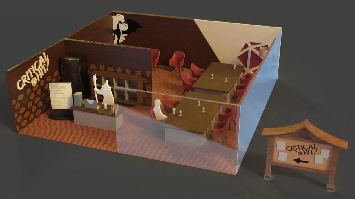
Likely my largest project to date, I was tasked with created a brand identity for a tabletop games store. This including not only their brand but also marketing material and mockups for interior spaces.
Roll
the
dice
〰️
Roll the dice 〰️
Roll for Initiative
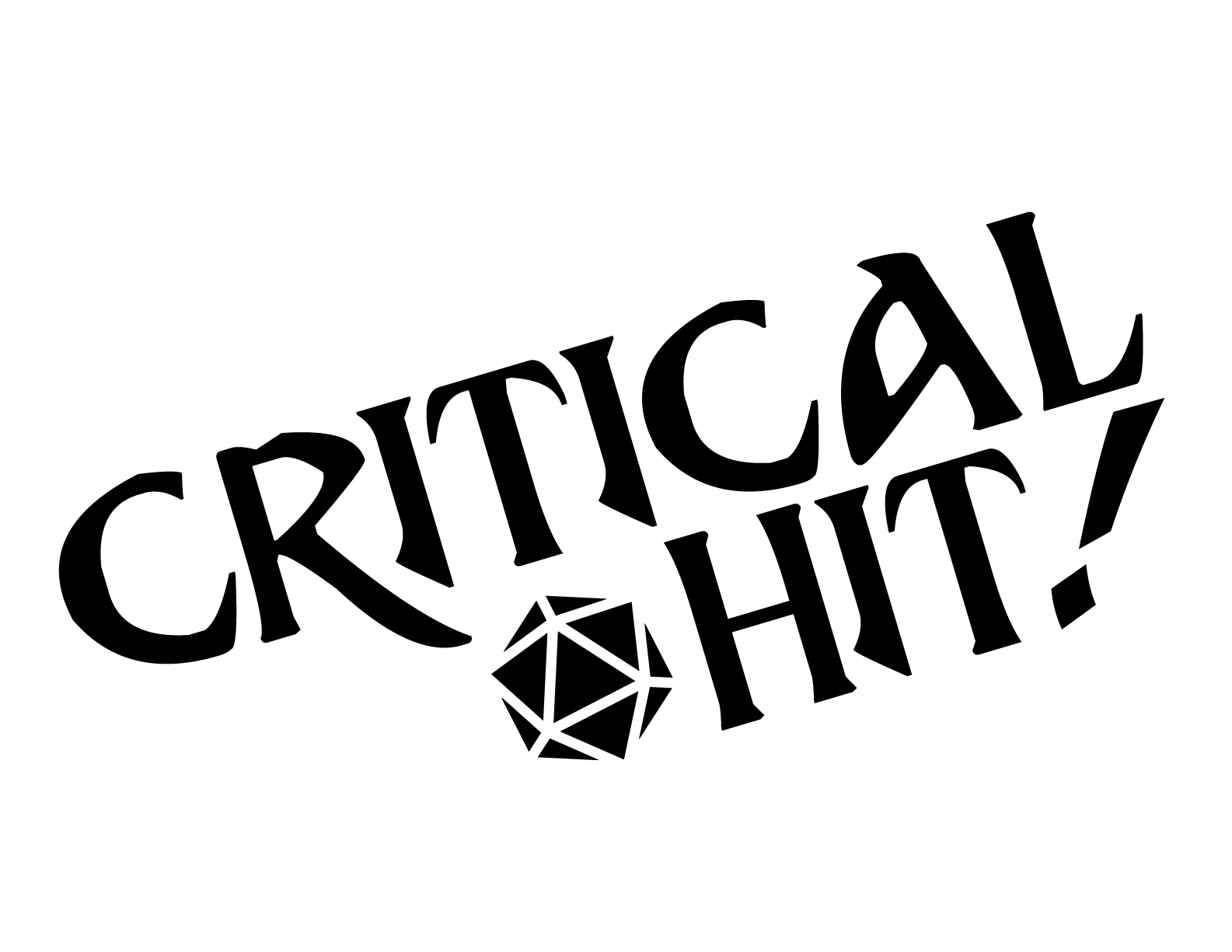
The name “Critical Hit” was chosen as it is a common phrase in tabletop role playing games for the highest roll possible on a die. I wanted this location to scream roleplaying and gaming, and nothing shows that better than the iconic 20-sided die.


Making it real
In creating a full brand image, I worked on creating several forms of advertising material including pole banners, a branded booklet, and mockup physical spaces to get an idea about how a real world space would look for this brand.